
Oct 10, 2026Customization
How to Match Pantone Colors for Custom Promotional Products
How to match brand colors on custom promotional products from China — Pantone references by material, how to brief a supplier, setting color tolerances, and the color mistakes that waste orders.
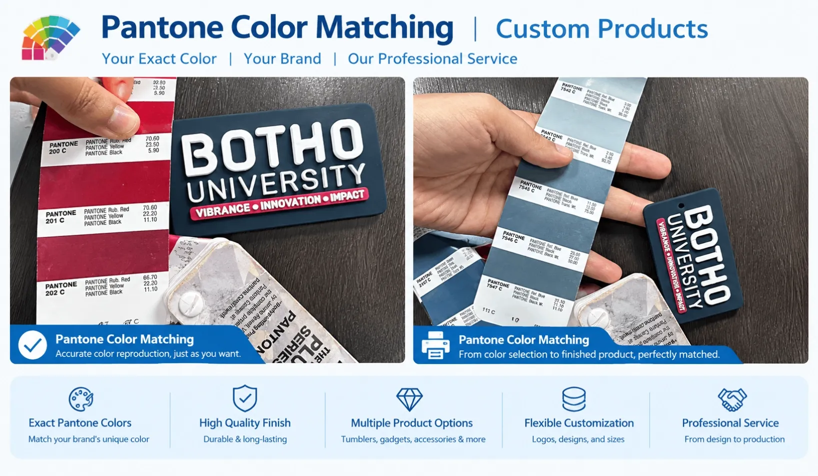
Brand colors are where corporate identity meets manufacturing reality. Your brand guide specifies exact colors — usually as Pantone references, hex codes or CMYK values. A factory in China, producing a tumbler, a bag or a box, works with inks, coatings, dyes and materials that each handle color differently.
This guide explains how to communicate your brand colors to a supplier, what color variation to expect and accept, and how to set tolerances that prevent the two most common outcomes: a delivered order that colors do not match your brand, or a rejection dispute over a difference no production process could have avoided.
Why Exact Color Matching Is Harder Than It Sounds
A hex code looks like a precise instruction, but it describes a screen color, not a physical one. Between the screen and the product sit several transformations:
- Screen vs print. Displays emit light; printed colors reflect it. A color that looks vivid on screen will look different printed even when the values match.
- Print method differences. The same Pantone reference produces slightly different results across screen printing, pad printing, UV printing and offset printing because the inks, layering and substrates differ.
- Surface differences. The same ink looks different on matte vs glossy, smooth vs textured, light vs dark surfaces. Coated surfaces can shift a color's apparent tone noticeably.
- Material differences. Colored products (as opposed to printed ones) take their color from the material itself — dyed fabric, powder-coated metal, molded plastic. Material color has its own production tolerance, wider than print.
- Lighting. The same physical product reads differently under warm indoor light, cool office light and daylight. This alone causes many "the colors don't match" disputes where both parties are looking at the same object.
The practical conclusion: exact color equality across materials and methods is not achievable. What is achievable is a defined, agreed tolerance — and that is what a professional color process delivers.
The Color Systems and When Each Applies
System | What It Describes | Where Used |
|---|---|---|
Pantone (PMS) | Standardized ink references on coated (C) or uncoated (U) stock | Printing: screen, pad, UV, offset. The primary reference for logo and print colors |
Pantone TCX / TPX | Textile color references (cotton and paper formats) | Fabric: bags, apparel — specifying a textile color |
RAL | Coating color standard | Powder-coated or painted metal products |
CMYK | Process print values | Full-color printing where exact spot color is less critical |
Hex / RGB | Screen-based color values | Digital artwork source; must be converted to a physical reference for production |
Rule of thumb by product element:
- Logo and printed graphics: specify Pantone (PMS C for coated paper, PMS U for uncoated). One or two references are workable; more colors add setup cost.
- Fabric items (bags, apparel, textiles): specify Pantone TCX for dyed fabric color, or use Pantone-matched print ink for printed logos on fabric.
- Coated metal (tumblers, pens, hardware): specify RAL for the product's own coating color, plus Pantone for any printed logo on top of it.
- Molded plastic: color is achieved with masterbatch added to the plastic. Provide a physical color standard (a sample chip or previously produced item) — this is the most reliable way to specify molded color, because it must survive the molding process.
How to Communicate Brand Colors Correctly
The communication process matters as much as the reference system. A workable sequence:
- Start from your brand guide and extract the physical color references — Pantone numbers, not hex codes, for anything that will be printed or dyed. If your guide lists only hex or CMYK values, have them converted to the nearest Pantone reference and review that conversion once, deliberately.
- State the reference system explicitly when briefing the supplier: "Logo printed in Pantone 286 C" is unambiguous. "Our blue is #1E4B8F" leaves the interpretation of coated vs uncoated, ink vs dye, and screen vs print to the factory.
- Provide physical references where possible. A Pantone chip book is standard at professional suppliers; if your brand has a printed piece (a brochure, a card) that carries the color correctly, that physical sample is stronger than any digital value.
- Distinguish product color from print color in the brief. If the tumbler body must be a brand color and the logo white, that is two separate color specs (coating/dye + print ink) with two tolerance expectations.
- Ask for the color sample before production. A sample produced with the actual method and material is the only reliable prediction of the production result. See our guide to logo printing methods for how each method behaves with color.
Setting Color Tolerance: The Conversation That Prevents Disputes
Color tolerance is the agreement on how much variation is acceptable. Two levels to set:
Element | Common tolerance standard | Notes |
|---|---|---|
Printed logo color | Match approved Pantone reference in the agreed lighting conditions; minor ink-layering variation acceptable | Agree which lighting conditions are the reference: daylight (most common) or neutral studio light |
Product body color (dyed, coated or molded) | Within the material's standard production tolerance | Material color has a wider tolerance than print. The approved physical sample defines the reference range |
Three practical rules:
- Set the tolerance at sample approval, in writing. "Logo color matched to Pantone 286 C on the approved sample; product body color within the approved sample's range" is a usable standard. "Colors must match exactly" is not — no supplier can commit to it, and no dispute has a resolution.
- Approve against the reference, not against memory. When evaluating a sample, compare against the Pantone chip or the approved production reference, under natural light, not against your screen.
- Do not request changes you cannot express as a specification. "Make the blue deeper" is not actionable; "shift toward Pantone 288 C" is. If your first sample feels off, identify which direction and how much, in reference terms.
Color and Cost: What Affects Price
- Number of print colors: each color adds a screen or plate setup in screen and pad printing. A two-color logo costs more than a one-color logo at every quantity.
- Spot color vs process color: specifying an exact Pantone spot color is normal for logos and does not itself raise cost much — but matching a spot color with CMYK process printing sometimes approximates rather than matches, so clarify which method the supplier intends.
- Custom product color: a custom-dyed fabric, custom powder coat or custom molded color usually carries a higher MOQ than stock colors, because the material must be produced for you rather than pulled from inventory.
- Color and finish interaction: whites and light colors on dark products need an underlay layer for the color to read correctly — a real cost that should be quoted.
A practical cost lever: if the budget is tight, using stock product colors with a Pantone-matched logo often achieves most of the brand effect at a fraction of the minimums and cost of custom product colors.
The Most Common Color Problems in China Sourcing
Brand guide hex code sent as the only reference. The factory converts it by judgment, and the result is approximate before production even begins. Convert to Pantone deliberately, once, before briefing.
Comparing screen and sample. The sample is correct and looks wrong because it is being judged against a backlit screen. Always judge color on the physical reference under neutral light.
Reading mockups as color commitments. A digital mockup shows placement and proportion; it does not represent the printed color on your chosen material. Approve the physical sample for color.
Different materials, one expectation. A logo on a matte tumbler, a printed box and a woven label will differ slightly even when all match their references. If these products appear together in one gift, decide whether the difference is acceptable before production — our guide to sourcing multiple gift products covers how to review a multi-product set side by side.
No written tolerance. Without an agreed standard, the only possible outcomes are accepting whatever arrived or arguing without a basis. Setting the tolerance takes ten minutes at sample approval.
Frequently Asked Questions
Can a factory match my brand color exactly?
A factory can match your Pantone reference closely on the specified material and method — that is standard practice. "Exactly" in the absolute sense is not achievable across different materials, coatings, lighting conditions and print methods, which is why the professional approach is a defined reference plus an agreed tolerance. Expect a close match on the same method and material, and defined allowances wherever the material changes.
What should I send to specify my brand color?
Send the Pantone reference (PMS C or U as appropriate), and state which element it applies to — printed logo, product body, fabric dye or coating. Add a physical reference if you have one (a Pantone chip, a printed brand piece). If your brand guide uses hex or CMYK only, convert to Pantone before briefing and review the conversion once. See our guide to custom promotional products for how specifications flow into a quote.
Why does the product color look different from the logo color?
Because they are produced by different processes: the product body takes color from coating, dyeing or molding, while the logo color comes from ink. Different processes on different surfaces have different tolerances. The result is a slight difference that is normal and can be managed by approving references for both elements separately.
How do I check color when the sample arrives?
Compare the physical sample against the physical reference (Pantone chip or approved brand piece) in natural daylight — not against a screen, and not under mixed indoor lighting. Check the logo color and the product body color separately against their respective references. If something is off, describe the difference in reference terms (which Pantone it should move toward), not in subjective terms.
Does custom product color cost more?
Usually yes, in the form of a higher MOQ rather than a much higher unit price. Custom-dyed fabric, custom powder coating or custom molded color means the material is produced for your order rather than taken from stock, so the material supplier's minimum applies. Where budget or quantity is a constraint, stock product colors with a Pantone-matched logo often deliver most of the brand effect at materially lower minimums.
Next Step
Color management in China sourcing comes down to four practices: specify in physical reference systems (Pantone, TCX, RAL), provide physical references where possible, approve color on a physical sample under neutral light, and write the tolerance into the approval.
If you have brand colors and a product list, send us your brand guide and requirements — we will confirm the correct reference system for each element (printed logo, product color, fabric, coating), flag any color that needs an adjustment to be producible, and set out the tolerance expectations before sampling. Browse our product categories to see where print and material colors typically apply.